
RealSelf iOS App
The Problem
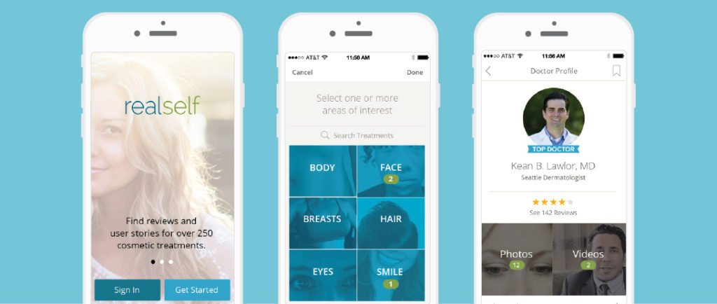
RealSelf had a popular cosmetic treatment information sharing site that members loved. More and more of their traffic was coming from mobile devices, especially on iOS. An iOS app could help members find what they were looking for faster and could allow the company to create new features that members had been asking for.
My role
Sole designer—helped determine new product features, conducted user research, developed wireframes, worked with developers to determine possibilities, and created designs and design specs.
The Hypothesis
By stripping down the concept of RealSelf to a customized feed of content, basic treatment shopping, and easy to use authoring tools, our customers will engage more with these features, increase time on app, and increase conversion.
The Project Story
I dove into previous qualitative research and customer behavior data from the site to guide initial concepts. By requesting preferences during sign up, we were able to present customers with a personalized feed. The feed would be built from existing content, including treatment reviews, questions and answers, and before and after photos.
Pre-design customer insights gathered:
- Demographic research
- Previous Quantitative and qualitative research
- Focus groups (for early information gathering, sentiment)
- Customer 1:1 interviews
- Competitive research
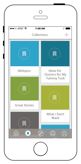
Since we knew the average time our customers would research a treatment was around two years, we wanted to provide them with an easily accessible way to save and follow information. Our customers often saved information to folders or sometimes printed out pages and organized them in binders. We knew we could create a better way to access saved information.
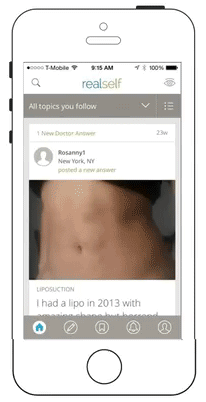
Also, RealSelf review writers would seldom write a single doctor review. Instead, most reviews tracked a person’s full experience with a treatment over time. The last updates for a surgical procedure would usually happen a year after the surgery date and customers were eager for that post-procedure information. Frequent updates and photos were the most requested improvements from our customers, so we knew that we had to make review writing and photo posting easy.
After testing initial wireframes with customers, I learned how important it was to clarify review timelines, and establish a clear relationship between a review update and the full review.
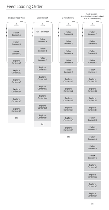
Another challenge I had in working on the app was defining the MVP for our feed algorithm. We needed to find a way to balance popularity, freshness, relevance, and variety in content. Customers had high expectations from what they had experienced in other app feeds, so we wanted to make sure they would not be disappointed. I proposed a few options, collaborating heavily with developers to ensure the final solution was lean, yet supported our customers well.
To help customers save content, I created a bookmarking flow. By saving information into folders called “Notebooks”, that they could name and organize themselves, they could easily find information again. Also, if a customer saved a review, they could be notified if the review was updated.
I also worked with developers to incorporate animations and transitions to make sure the app felt satisfying to use. I created several animations to demonstrate how I expected the animations to work.
Result
Feedback from RealSelf beta users was overwhelmingly positive. The app quickly gained a 4.5 star rating and has hovered between 4.5 and 5 in the App Store since then, building a steadily growing following. After launch, I continued to test, refine, and build out new functionality for the app based on feedback from customers.
This first launch was before the RealSelf re-brand.