Rebranding RealSelf
The Problem
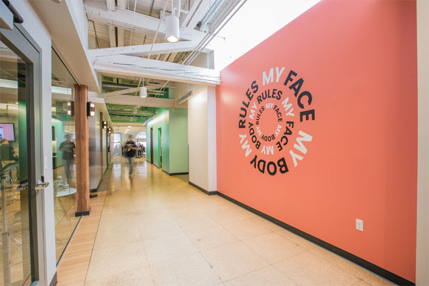
RealSelf was poised for growth and ready to invest more in marketing, but their existing brand no longer reflected how they saw themselves as a company. RealSelf wanted to position themselves as the world’s most trusted online destination for improving your body, face, and smile, empowering people to make smart decisions. By allowing members to share their real stories and photos instead of unattainable idealized beauty, the company was helping people better understand what options might work for them.
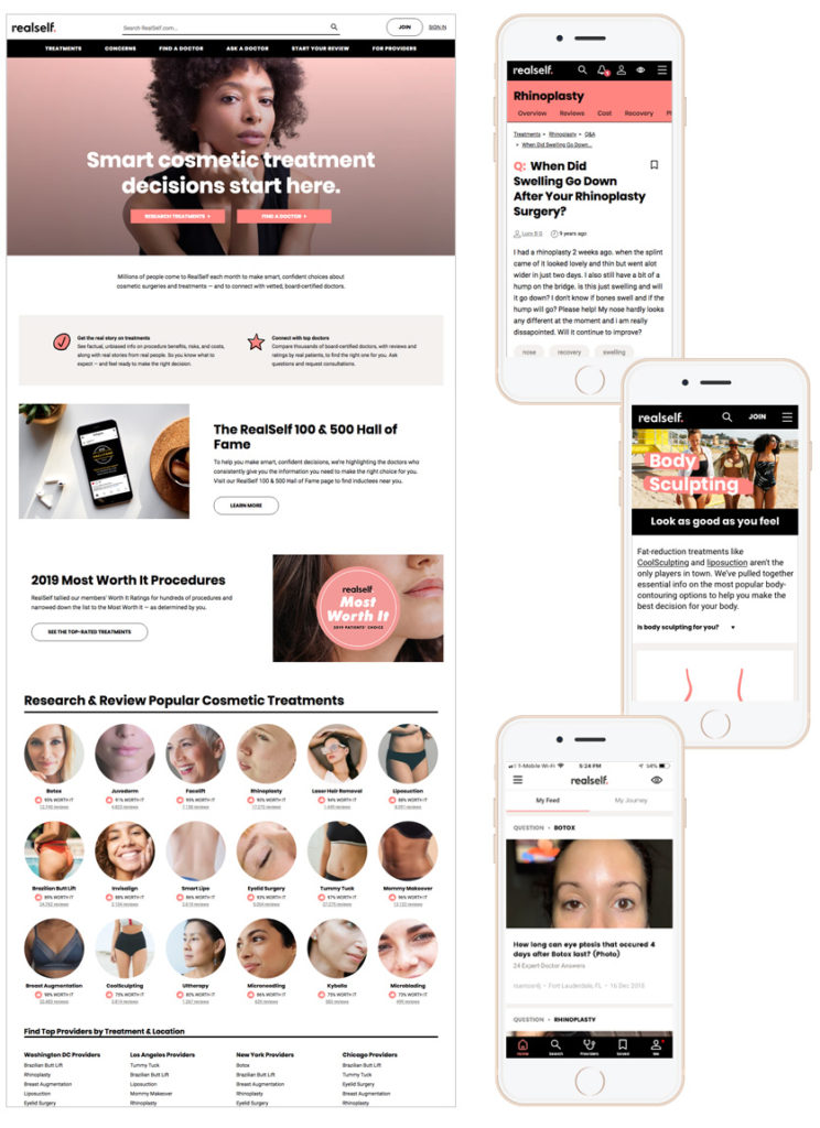
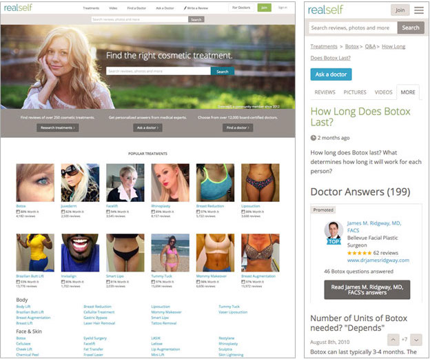
The site was burdened with a dated, unremarkable, and inconsistent UI that did not encourage customer trust. Additionally, in user testing, we noticed that due to a lack of visual distinction, participants would often say they found information about cosmetic treatments “on Google”, when really they had been reading the information on RealSelf. As a company that focused on aesthetics, it was time for us to give our product a facelift.
The Hypothesis
By aligning on a clear brand story, messaging, and refined visuals, we would better appeal to our target audience and increase brand recognition.
The Project Story
Stage One: Developing a new brand
- Rebrand Kickoff
I presented a case for a re-brand to our company executives, who agreed to go forward with the project. I suggested using an external agency to help us through the process. At the time, we did not have the resources internally to get to our desired result. This made sense to the CEO and stakeholders, so we worked together to outline a budget and set high level expectations. - Agency Vetting
I led the agency research and vetting process by creating a project brief, defining evaluation criteria, conducting phone interviews. One I narrowed the selection down to a few options, the CEO and I met with and interviewed a shortlist of agencies in person. - Research and Data Analysis
Once we picked an agency, I led the process of gathering information and data to share with the agency to assist in their market research. Using existing internal and external data, I wrote up an analysis document to make a case for a specific target audience. There were still some remaining pieces of feedback we needed from customers to make sure the rebranding was successful, so I defined which new user research would capture this additional information. I worked with our internal marketing team to conduct surveys and customer interviews to gather psychographic data and customer sentiment.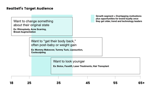
- Feedback and Coordination
I was the point person for agency questions and communication throughout our engagement. I participated in branding exercises, weekly calls, and all review sessions. I provided detailed, concrete feedback and distilled feedback from others into clear direction along the way. - Define Rollout Plan
When the brand definition work was close to completion, I defined a phased plan for how the UI and UX changes would launch within the product to avoid a “frankenstein” effect where inconsistencies are obvious, and how to test changes. I collaborated with the product manager and others to create a full launch plan and then kicked off the project with my visual design team and front end developers as they defined how the new brand applied to each UI element. - Refine Guidelines and Photo Shoot
After we received the final brand concept from the agency, there was still a lot of work to be done to create a functional brand guidelines document that defined for the company how to use the brand. I worked with my Visual Design Lead to determine if there were any adaptations that needed to happen as we expanded the guidelines that were handed off by the agency. I continuously reviewed work from him and his team to make sure we were aligned on direction.
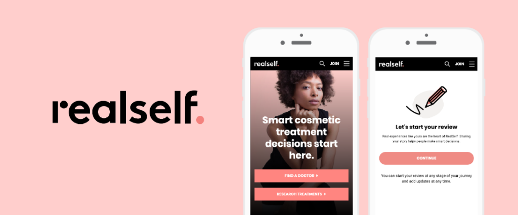
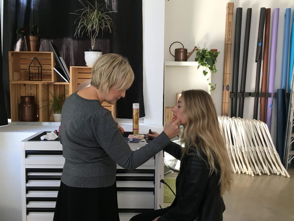
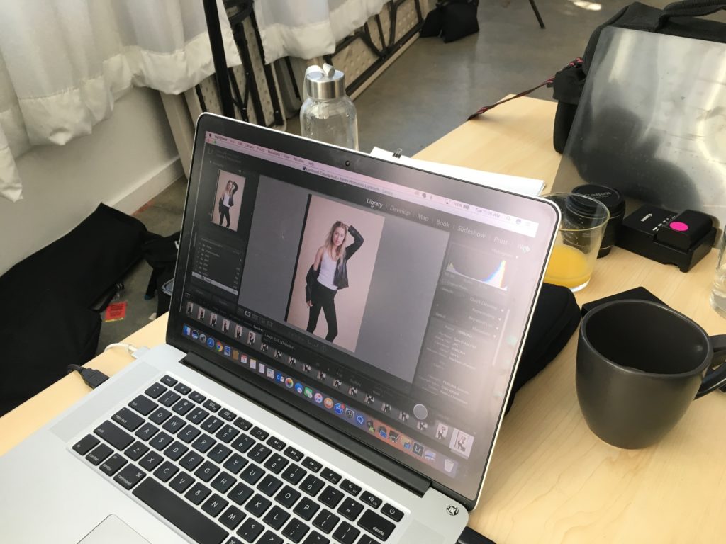
To fully flesh out the new brand, we needed to set up a custom photoshoot, so I worked out a budget and got approval to go forward. I supervised my team’s creative brief, the hiring of the photographer, location, and models. While scrappy, the shoot resulted in many high quality branded exclusive images that we have used in many ways.

8. Internal Launch
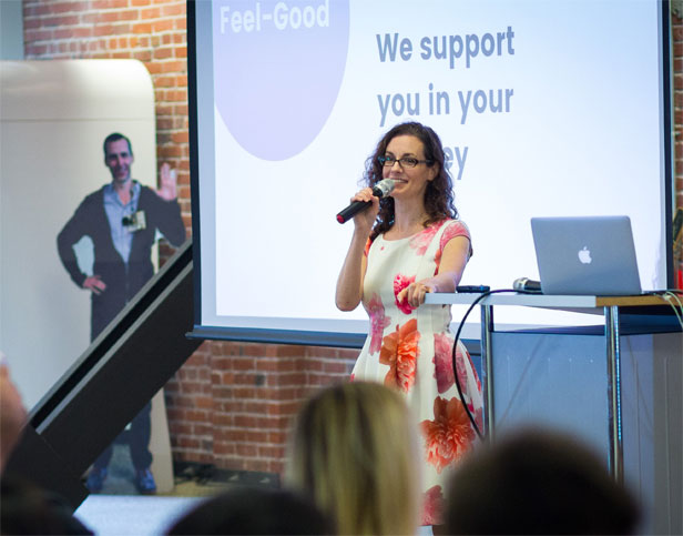
I presented the new brand with fanfare at an internal launch event and shared project updates during a board review. I also sent out brand FAQs to help aid fellow employees understand why we were rebranding and what to expect.
Stage Two: Re-branding Our Product
- Re-brand Product Prep
Rolling out a site re-brand is always tricky—do you launch it all at once to avoid strange inconsistencies or can you test portions first to make sure that the new look won’t cause your key metrics to tank? At this point, we were already running qualitative tests with customers to get their feedback on our new brand, but we still needed to learn how behavioral metrics might change when the new brand was in production. I helped determine key metrics and expectations to measure the success of the project and worked with our analytics group to create a dashboard we could easily check. - UI Style Guide Creation
As my team worked on re-branding all UI elements to hand off to developers, I supervised to ensure they were designing with an eye for reusable elements, UX best practices, and were thinking systemically. - A/B Testing Results
Results of the re-brand tests were neutral to slightly positive. I kept an eye out for any unusual results and we continued to iterate on areas that were problematic. For example, provider website clicks/taps were down 20% at first, so we changed the style to ensure a better visual balance for the CTAs that matched their level of importance. - Follow Up
After the brand rolled out, we continued to evolve it to better reflect the needs of our target audience and improve their experience.