
Alaska Airlines Announcements
The Problem
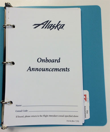
Alaska Airlines flight attendants were using a bulky and poorly organized binder to deliver in-flight announcements. Since announcements could vary by departure or arrival location, type of plane, time of day, and many other factors, this system was very difficult to manage amongst all their other responsibilities.
Also, attendants had to be physically holding the corded microphone while using the tethered binder, which was awkward and inconvenient.
The Hypothesis
If we incorporated flight attendant announcements into the new flight attendant app, delivered in an organized way for the correct conditions, we could help attendants spend less time fumbling through the binder and improve efficiency and accuracy.
The Project Story
My role: Lead UX/UI designer and researcher. Reviewed and gave feedback to other designer on the project, directed her work.
This project was very interesting to me because, while I was working on extending the functionality of an app, we were also considering how to solve for real world efficiency and ergonomics.
I started off by interviewing our subject matter experts—ex-flight attendants who trained new flight attendants how to do their jobs. I learned a lot about how attendants are trained to use the binders, how they are organized, how updates are made, and how attendants are informed about these changes.
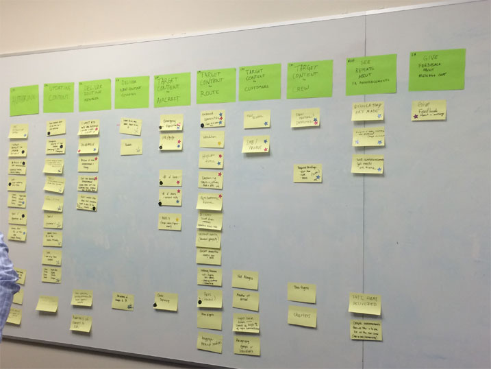
Since there was a lot of opportunity to help flight attendants with announcements, the team and I led them through a prioritization process to make sure the MVP included the most essential functionality.
Next, I borrowed a binder to dive deep into the content and how it was organized. It became very obvious that there was a lot of room for improvement and that some information architecture work would be necessary.
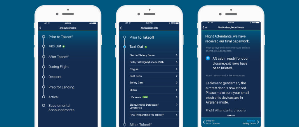
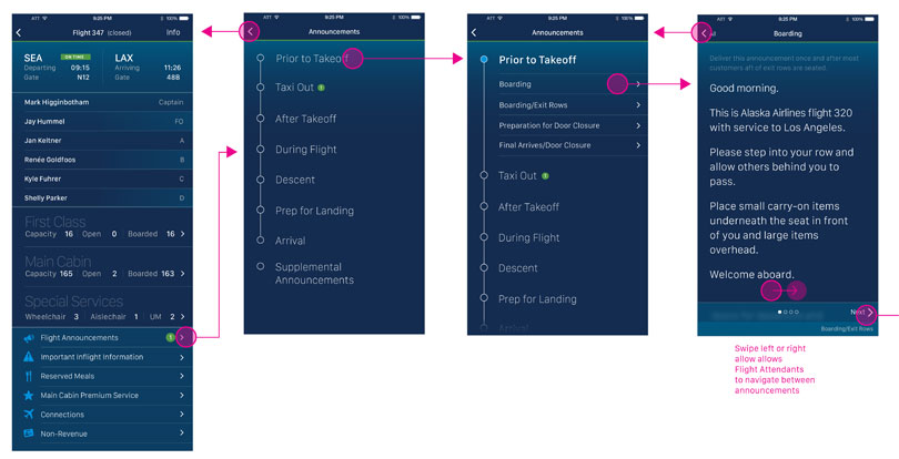
Since we would be able to customize announcements according to the conditions of the flight, it was possible to simplify the general flow to the stages of a flight.
To keep the time-based analogy, I designed the main announcements view as expandable sections of a timeline. Once in a section, attendants can scroll through the announcement or horizontally swipe to the previous or next section.
Specific ergonomic challenges on this project:
- Flight attendants needed to be able to easily use this app with one hand (since their other hand was holding the microphone).
- I needed to make sure the text and spacing was big enough to read easily, even in a dim light.
We needed to make sure the app solution we were creating worked for actual flight attendants, so we scheduled two rounds of testing.
The first test was mostly a usability test, looking for issues and annoyances. Through the company, we were able to get access to the lounge where flight attendants waited in between flights. I had created prototypes of two versions for the flight attendants to test, and we got a lot of helpful feedback on the prototypes as well as ideas for future iterations.
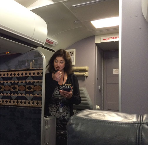
Once I made revisions based on their feedback, we were then able to have a few flight attendants test a high fidelity prototype in a real world situation—an actual plane. Alaska Air has a partial plane inside a building that they use for flight attendant training. So the flight attendants that were helping us practiced holding a real plane microphone in one hand and a phone in the other, while using the app to deliver announcements.
According to the flight attendants, the app worked very well for them and was ready to go.
Result
Flight announcements was launched in the Alaska Air Flight Attendant app and was received very positively by flight staff because of how it increased their efficiency. It is still used today.