
Groupon Getaways section
The Problem
When customers landed on the Groupon Getaways section page of the Groupon site, they encountered what was essentially a search result page of deal listings. What if the customer was looking to book a hotel but wasn’t sure where to begin and where they wanted to go? Those “flexible intent” customers had to scroll through many listings with little guidance. In addition, an exact search for a location might not get you the best deal. Groupon did not have a massive inventory of deals for travel, but we could deliver great options for beaches, a local weekend away, or other types of thematic travel.
The Hypothesis
If we created a merchandized front page for Getaways, we could help shoppers better find what they were looking for, highlight our best deals, and increase conversion while making our customers happy.
The Project Story
My role: UX/UI designer, led research
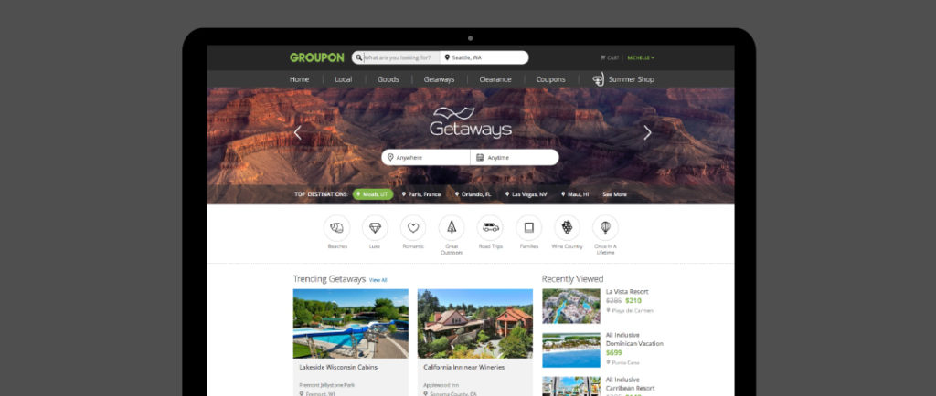
Before: the “search results” Getaways main page. The only distinction between deals is that one deal is featured at the top of the page and limited time deals are distinguished from ongoing deals. No other merchandized groups exist to help the travel customer browse and shop.
In many ways, this was both a “blue sky” project and an MVP to help us consider how we might break this page into differently merchandized units. Search was still possible and still a focus for shoppers who knew what they wanted, but I also broke down how travel shoppers might browse for a new trip.
Here’s the “after” version, offering many browse options to shop for travel. Customers still have the option to search and filter results, but this new page appeals to the interests of different kinds of travelers, including customers with flexible intent. Flexible intent travelers know part of what they are looking for, but not all. For example, “I want to go away this specific week in February to go skiing, but am open to different places.”
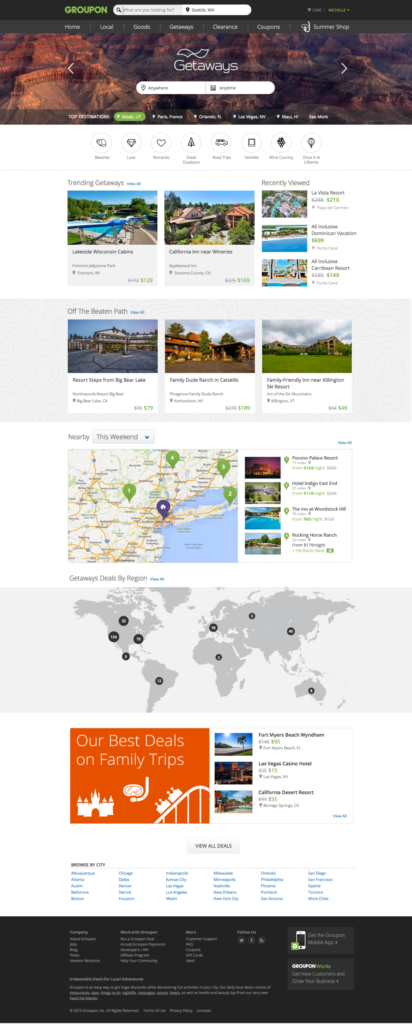
I created the top hero section to serve as both an intriguing background for search as well as an inspiration to different destinations where we had particularly interesting deals. The theme buttons (Beaches, Luxe, Romantic, etc) allowed customers to dive right into deals that met those specific needs. I created a flexible widgetized approach for other groups of deals on the page, which allowed merchandizers flexibility based on inventory and for customers to see highlights about what was offered based on the week or month.
The “Nearby” and “Regional” concepts were new ideas I put together based on data and customer interview research. Nearby/near-term trips were a common request from Groupon customers and we had a new product that allowed them to find last minute booking deals. The regional map helped the customer who knew generally where they wanted to go, but not exactly.
Result
The new page tested well with research participants and developers were able to build an A/B test quickly. Since the page was modular, the team was able to test individual aspects of it to continue to refine how it was merchandized.