RealSelf Customer Journey, Personas, UX Principles

One of the ways that I provided clear direction while helping RealSelf become more customer focused is through the use of guides and tools. These three examples are just a few of the tools that I created to help the Product/UX/Engineering organization speak the same language and move in the same direction to best help our customers.
My role: Owned and drove these projects—initiated research, research analysis, created documents, led discussions and review
Customer Journey
The Problem
Our sprint teams were actively planning their road maps, but few were considering the end-to-end experience for customers and providers as a whole, causing odd gaps in the experience. Though my team and I had created a customer journey map in the past, it became apparent that the old version no longer reflected the business accurately, nor the true customer path. Also, RealSelf is a two-sided marketplace, yet the provider’s journey had never been mapped.
Hypothesis
If I created a comprehensive journey map that showed both the customer and the provider common pathways, this tool will help the team build a more complete and engaging experience for both types of customers.
The Project Story
RealSelf already had a lot of customer and provider research, so I was able to gather what I needed to get started.
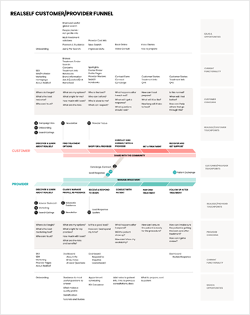
In order to help us keep a better eye on the end-to-end experience for customers and providers as teams continued to focus on specific feature areas, I created a Customer and Provider Journey Map with updated stages that displayed how the two journeys reflected each other.
I broke out the following:
- Existing touch-points, from both RealSelf to customers or providers, and where they interacted with each other
- Common customer or provider concerns at each stage
- Current functionality that existed for each stage
- Ideas and opportunities for each stage
On a separate view, I was able to show:
- How the work of each sprint team mapped to the journeys to clarify where they were helping our customers and providers.
- Areas of collaboration with other teams

Benefits of creating a journey map
With a clear view of how we were helping our customers and providers in their journeys and where we were not, it became easy to see areas of opportunity, share ideas, and avoid gaps in the experience. It has become a useful tool to help us think through what both types of customers go through and where and how we can help them better.
This map became a living document and evolved as we continued to learn more and build out additional features. In this first iteration, for example, I did not include a detailed emotional highs and lows chart, other than to show through color value the emotional intensity of each stage based on our research.
Rollout
By engaging co-workers in various roles to give feedback and offer suggestions as this map was created, I was able to foster interest and engagement even before the rollout. I also shared clear information about how the map could help people in their every day jobs, and created an “in real life” version on one of our office walls to make it easy to collaborate together on an end-to-end process.
Result
Team members reported a much greater understanding of how their work related to the whole of the RealSelf experience, and we began closing experience gaps by pursuing some of the opportunities identified.
Personas
The Problem
After receiving data from a new marketing quantitative study that gathered more information on our shifted target audience, we realized that our existing personas were no longer relevant. Also, while we were gathering continuous feedback from customers, it became apparent that we were not providing a complete solution for any one customer.
The Hypothesis
If I created and validated new primary persona options, we could use them not just on individual projects, but also for defining a strategic roadmap.
The Project Story
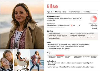
I began by gathering the quantitative target audience data summary and broke out the main ways groups diverged from each other from a product perspective. For instance, were they open to surgical options or did they prefer non-invasive treatments? Had they had a treatment before? Which barriers and goals were relevant to which persona? I also mapped the personas to two things—behavioral examples we had commonly seen from customers in interviews, and a new data point that I had been researching for some time—shopper types.

Shopper types were based on patterns I was seeing in our qualitative interviews. I requested an additional quantitative study to validate the main types. Some customers wanted to research on their own without additional guidance. Others were very interested in guidance and interventions like customer support chat. The last group was heavily influenced by their peer groups and social networks and only made large decisions based on other people’s recommendations.
After putting together draft versions of three persona options, I worked on validating that those specific combinations were actually common. So, I had my research team hep seek out that information. We did find that those combos were common and chose to move forward with the three options.
Next, I presented the 3 primary personas to the CEO and other stakeholders, breaking out the strategic implications of choosing any one of the three as the primary persona. As I mentioned to them, the way to think about the personas was which one do we focus on now, who is next in strategic importance, and which persona is the lowest priority at this time?
Overall, there was a general consensus that one of the personas was the most strategically important to deliver on first. We were also able to get some feedback from one of our industry partners, who validated our choice.
Result
We were able to align on a single customer type to deliver for in the next year, helping us to prioritize work and think about the full experience of that customer. Also, we established a clear prioritized pathway for focusing on the other identified personas in the future.
UX Principles
The Problem
With a busy and growing UX team, reviews and collaboration weren’t enough to ensure that we were working towards the same goals. The team needed a clear direction for what they were trying to achieve in order to push designs to a cohesive, quality result.
The Hypothesis
If I put the concepts we had been discussing into a concrete and easy to remember format, we would establish a common language and goal, which would lead to a better result.
The Project Story
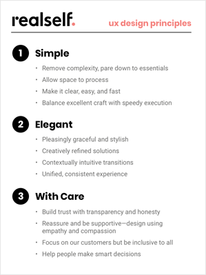
I took a lot of the concepts my team and I had been discussing and winnowed them down to three basic principles. After presenting the draft to the team, I incorporated their helpful feedback to solidify our common direction.

Result
After the UX Principles were formalized, my team was more in sync on direction, and I found that it was a lot easier to align during reviews.

